I have decided to reflect upon my business project about how I have used the creative fluency method. For my Business 9 class, we were instructed to create a company for our final project. We essentially had to work with our partners to brainstorm ideas and create a creative pitch for our teachers. This followed the format of how a shark tank pitch works. To complete this project there were multiple things we had to complete in order to have an effective marketing campaign. With this, my partner and I had to create a print ad that would show on magazines or flyers as it gains a lot of attraction from those types of media. In saying this, our assignment was essentially to create a magazine ad that would showcase the product created by our company called “Vegant”. Using the 5 I’s method we were able to create a practical and influential ad.
Identify
 For this assignment, our teacher provided straightforward criteria in which we had to follow in order to have a proper and outstanding print ad.
These were including the information towards these starters;
What are you selling?
How much does it cost?
Where can it be purchased?
What are some of its features?
What is the unique selling feature of the advertisement?
Why do people want to look at it?
What magazine have you placed the advertisement in? and Why?
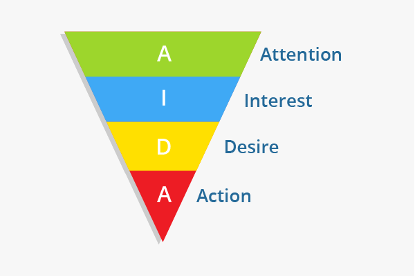
Including this, we also had to stimulate the different parts towards “AIDA”. This calls for incorporating attention, interest, desire, and action. This meant to attract the audience with a catchy headline that is not too long to remember, gain their interest through simple, easy to read, clear and to the point information. Additionally, we had to achieve desire by connecting our product to a problem that can be solved by describing the benefits using words and images to make people want to buy our product and call for action by showing them where and how to buy the product by including the brand name, logo and contact info. This being stated, one of the challenges that my partner and I immediately thought of was how we were going to include all of the information provided but still create an ad that was sleek and professional. Ultimately, if we were going to directly state the starting points in our ad, it would cause the ad to be overwhelmed with information making it essentially harder to read and messier.
Inspire
 To give us some inspiration, our teacher provided us with the example of a Telus print ad. With this, she also explained how the ad accompanied the different parts to AIDA and how the ad fit the central theme of Telus and how they approached incorporating it. Looking at the Telus ad, it gave us an understanding of the different colours we should use in our ad and the amount of information that should be included in order not to have the ad too clumped together.
My partner and I also decided to search for examples that portrayed our main theme of a vegan dessert. Looking at Pinterest, here are the examples we found.

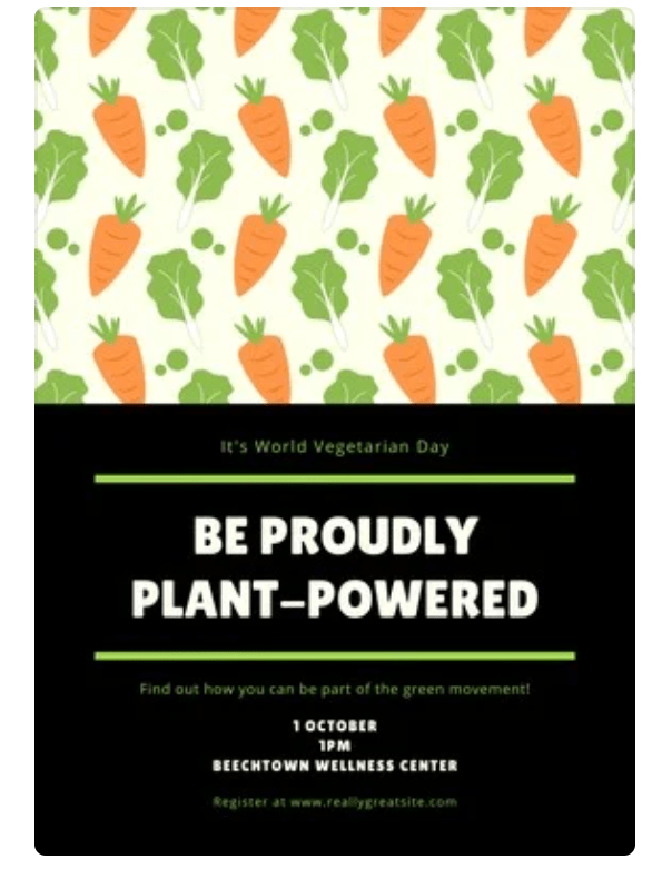
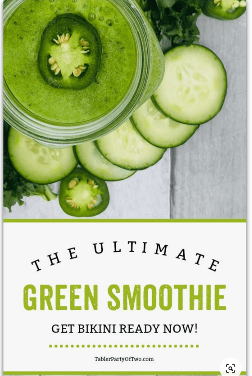
Looking at these templates, we figured that many of them were placed upon recycled paper which is often thicker and brown in colour. This was a creative idea as it fits our product of sustainable and vegan food sources. Using the recycled paper it essentially goes along with our theme and gives our print ad a unique look.
Interpolate
 In both of the Telus and examples found on Pinterest, we observed that they contain a central theme and had the same colours used throughout. This planning allowed for all of the ads to look easy on the eyes, simple and easier to read. Also, all the example ads had a headline that really attracted the attention of the audience and this was often short and simple while still conveying what the product is. The “interest” part of AIDA was also attracted by obtaining a clear and easy to read ad which had simple language and concise sentences. We also observed that they had a visual component that added to how pleasing the ad looked. Also, the ads seemed to follow the same font or 2 types of font throughout this also made it look visually appealing. Additionally, the ads applied the action part to AIDA by providing contact information at the bottom or corner of the ad which is showing the customers where they can get more information and where they can purchase the product/service.
Imagine
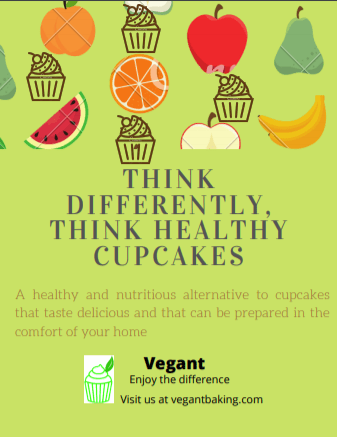 To create our print ad, we decided to use the website called Canva which provides a lot of free templates and images to create flyers and business cards. Based on both the Telus ad and the examples we found on Pinterest, we realized that we wanted to incorporate and mainly use our company colours which were green and light grey. As seen on the Telus ads, they mainly used white and purple throughout and can be connected to those colours. We decided to use our company colours as we believed that it would tie our company together and would remain consistent as we already used those colours for our letterheads and business cards. Also on the examples, they seemed to have a quick and short headline that drew in the audience and this was bolded or in a different colour compared to the other text. We found this technique useful in gaining the “attract” aspect of AIDA. Working with the challenge of keeping the information concise, we learned that the examples provided all contained 1 sentence other than the headline to provide more details. We then knew that we had to connect our product to a desire all in one sentence in order for the audience to gain interest. From this, we created a simple and short description of what our product was and what the benefits are. For keeping the interest and building desire, we tried to create a visual that would show that our product is a healthy, guilt-free dessert. We then placed images of fruit along with our logo of a cupcake together to showcase how our recipes are healthy. We also decided to add our contact information such as website, logo and name so that the audience would be more likely to remember the brand name and they can visit our website to order the product. Here is a link to a pdf of our ad for a closer look
Inspect
 When finishing our print ad, we decided to read over the criteria to make sure that we have included everything necessary. For stimulating AIDA, we drew in attention from the short headline and bold colours used, we grew interest from short simple sentences, created desire by connecting our vegan cupcakes to solve the problem of healthy desserts, and called for action by providing contact information at the bottom along with our company name to connect the product to the brand. Including this information also answers the questions listed in the criteria. The ad was also creative as it meets our target market of vegans who wish to eat healthy desserts. Looking back at the process of creating the ad, one thing my partner and I could have improved on was how long it took us to create a headline. As stated before, the headline is the most important part of an ad as it is what draws in the attention of the audience and being bolded, bigger in font and often presented in the middle it is essentially the main part of the ad. It was difficult to come up with one at first but we perfected after hours of brainstorming and in the end, we were proud of the final ad that we created.
The creative fluency method is ultimately a useful skill and I plan on using it in my future years as it makes sure that I follow the criteria in the identify stage while still allowing room for creative expression in the imagine stage. Moving forward academically, I will definitely use this method as I am planning to continue my education in marketing which requires creativity for campaigns and advertising as well as other subjects that require me to create something. By learning about this method, it has required me to think more deeply about the creative thought process and has allowed me greater success.